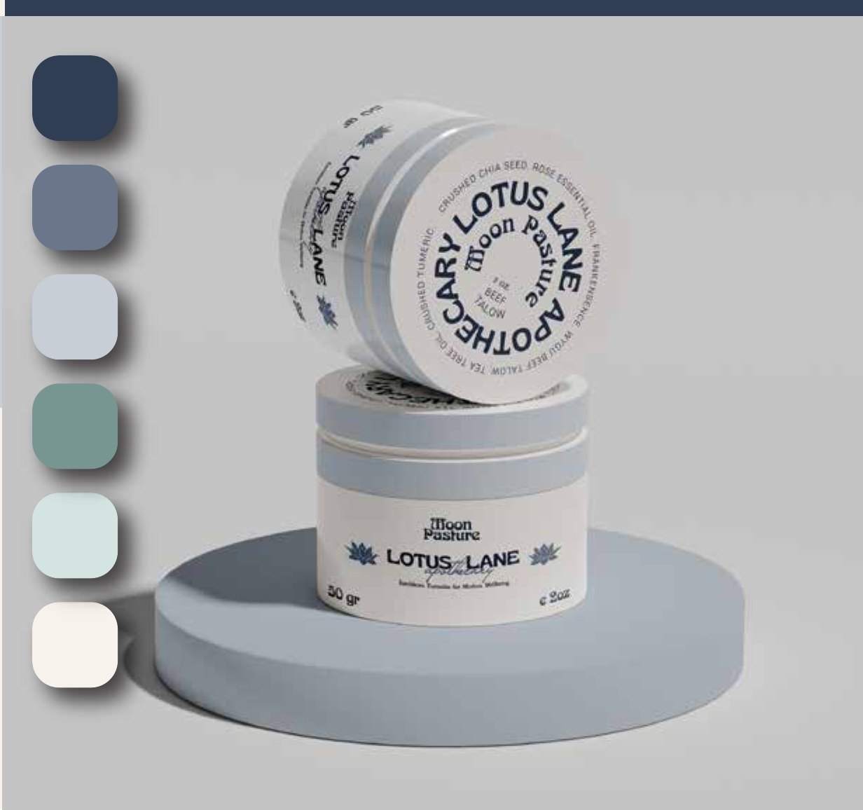
A full brand identity and product packaging system for a modern apothecary — earthborn formulas, given a calm, botanical, credible face from logo to label.
Lotus Lane Apothecary makes natural wellness formulas — "earthborn formulas for modern wellbeing." They needed a brand that could sit on a shelf next to established wellness names and feel both ancient and current: rooted in botanicals and ritual, but clean enough for a modern buyer.
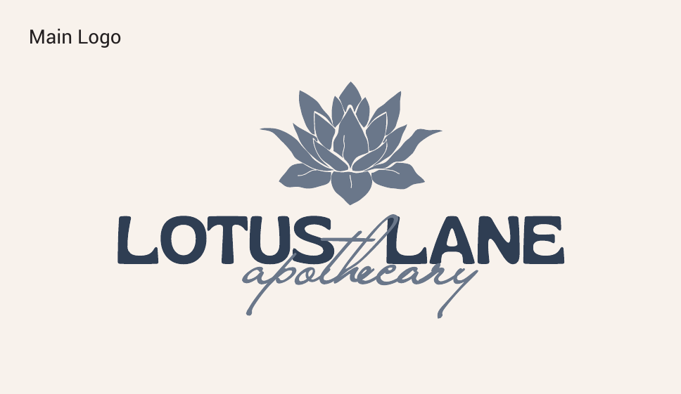
We built the whole identity from the ground up — a primary logo pairing a hand-drawn lotus with an apothecary wordmark, plus secondary, tertiary, and monogram marks for every context — then carried it onto the product itself with full packaging design.
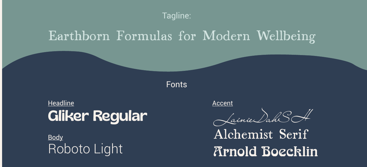
The palette leans into calm: deep slate navy, dusty blue, sage, soft mint, and cream. Typography mixes a clean modern headline with alchemical serif accents — a nod to old formulation books without tipping into costume.
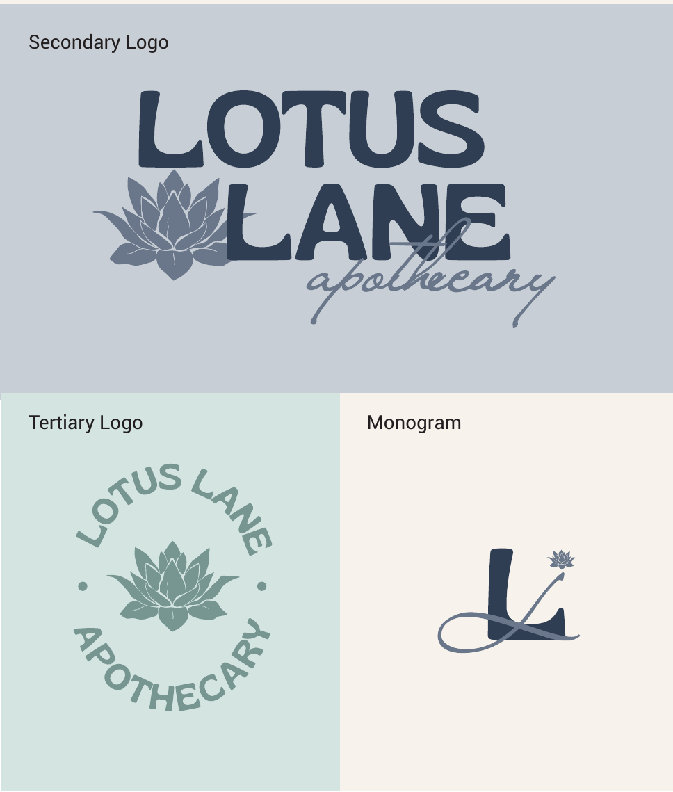
A complete logo suite — a lotus-and-script primary mark, a bolder secondary lockup, a circular badge, and a monogram — plus the palette and type system that hold it all together.
Primary, secondary, tertiary, and monogram marks.
Secondary and tertiary logos for every context.
Calm botanical colors and an alchemical type system.
The brand carried onto the product — jars and tins with curved-text lids and labels, designed to look considered in hand and photograph beautifully on a shelf.
Containers, lids, and labels for the product line.

A complete apothecary brand — logo suite, palette, type, and product packaging — calm and botanical enough to feel like ritual, clean enough to sell.
Tell us what's on your plate. We'll come back with what we'd do first and what it would cost, usually same day.
Prefer to talk? Call 442-291-9337 or book a free call →