Website
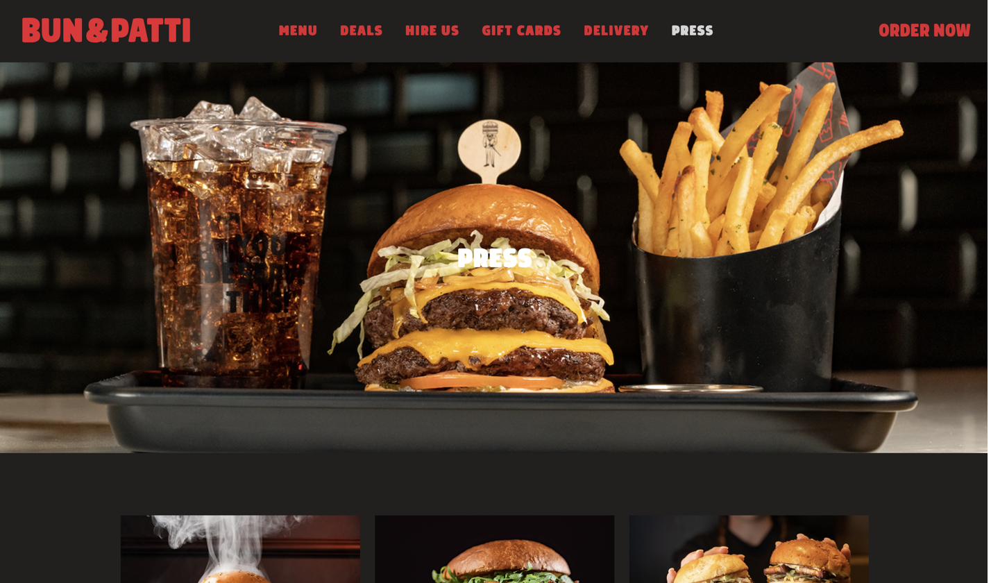
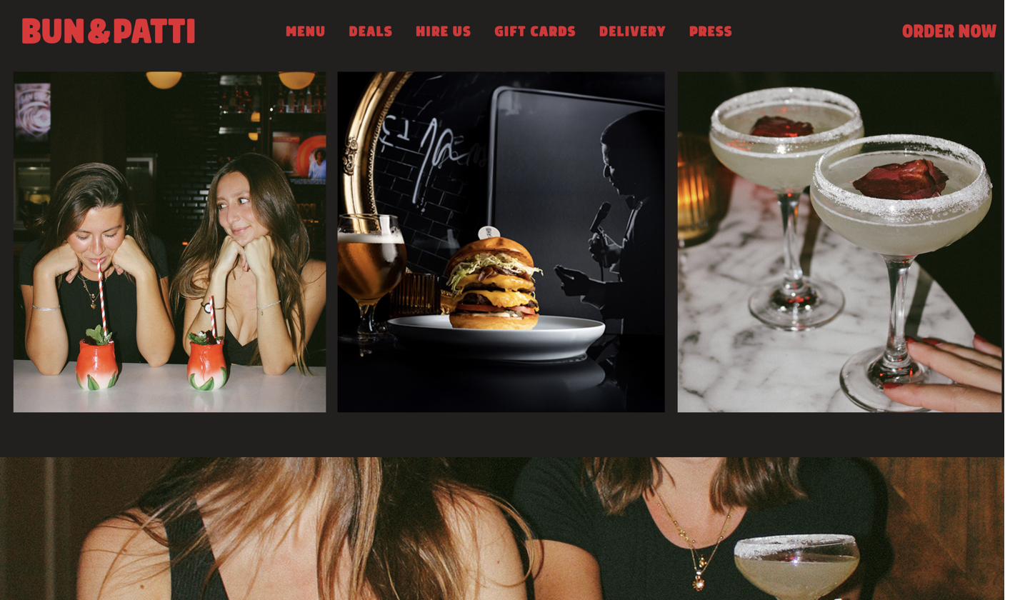
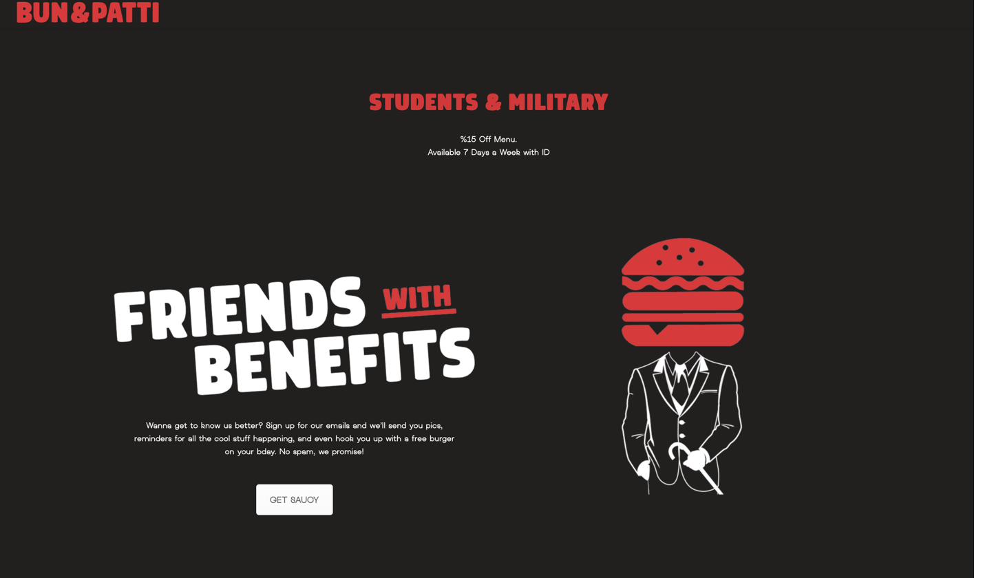
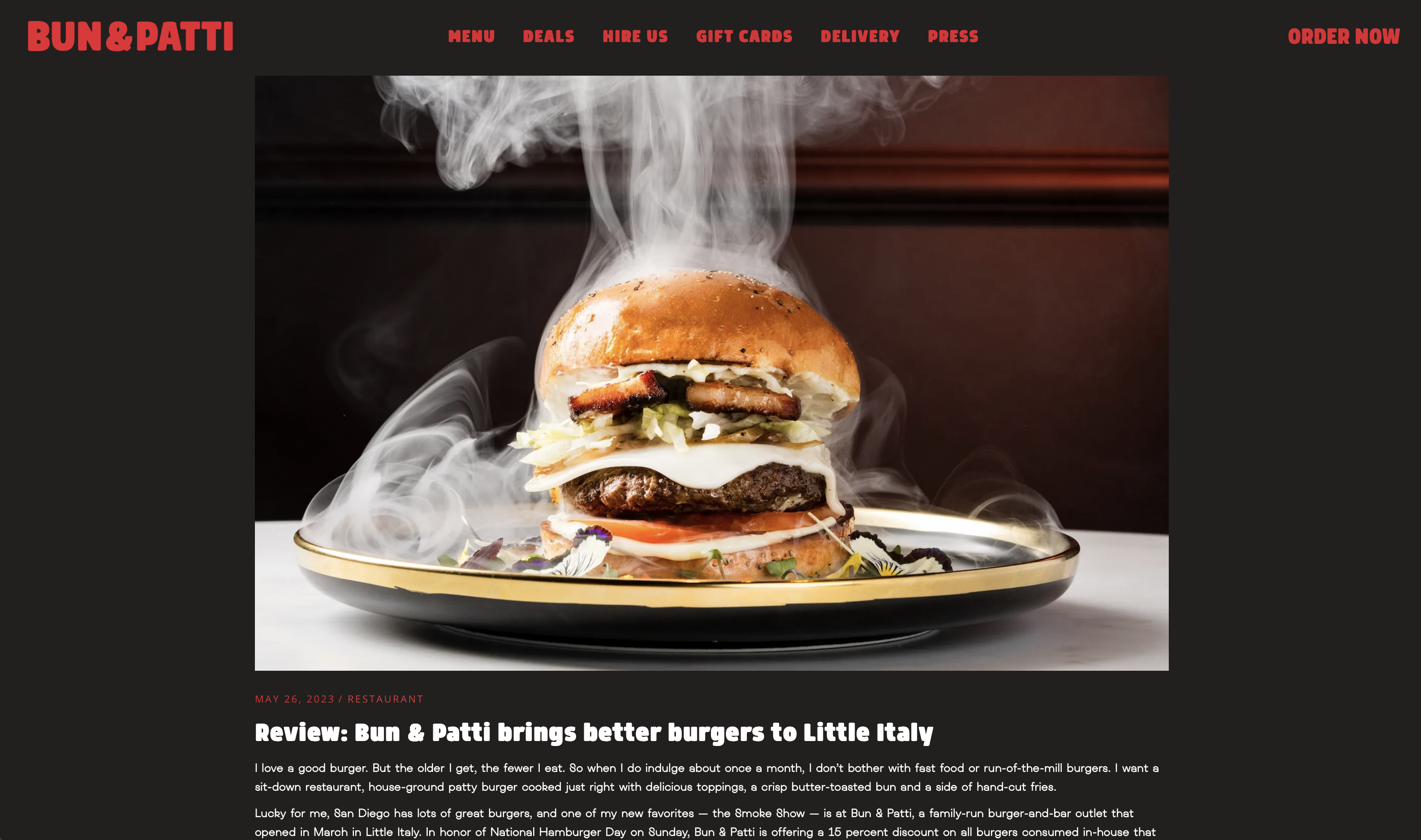
We designed and built their website too — the brand carried from the sign to the screen.



Bun & Patti started as an idea rather than a business — so the work began before the logo did, with the concept itself.
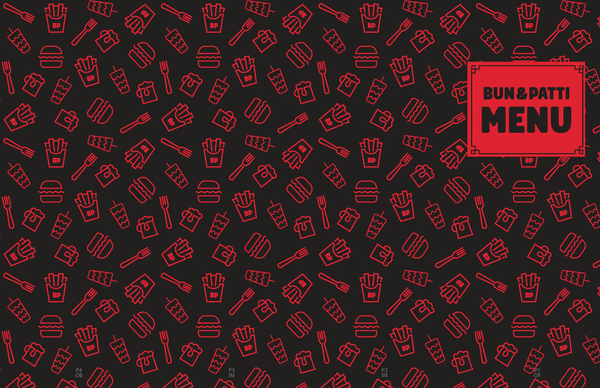
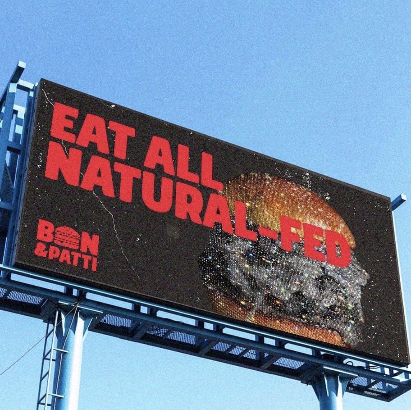
The identity builds the product into the name: the U of BUN becomes the burger, stacked in the wordmark, so the mark reads as food before it reads as type. Bold, red, and unfussy — designed to hold up on a sign across a car park as well as it does on a menu.
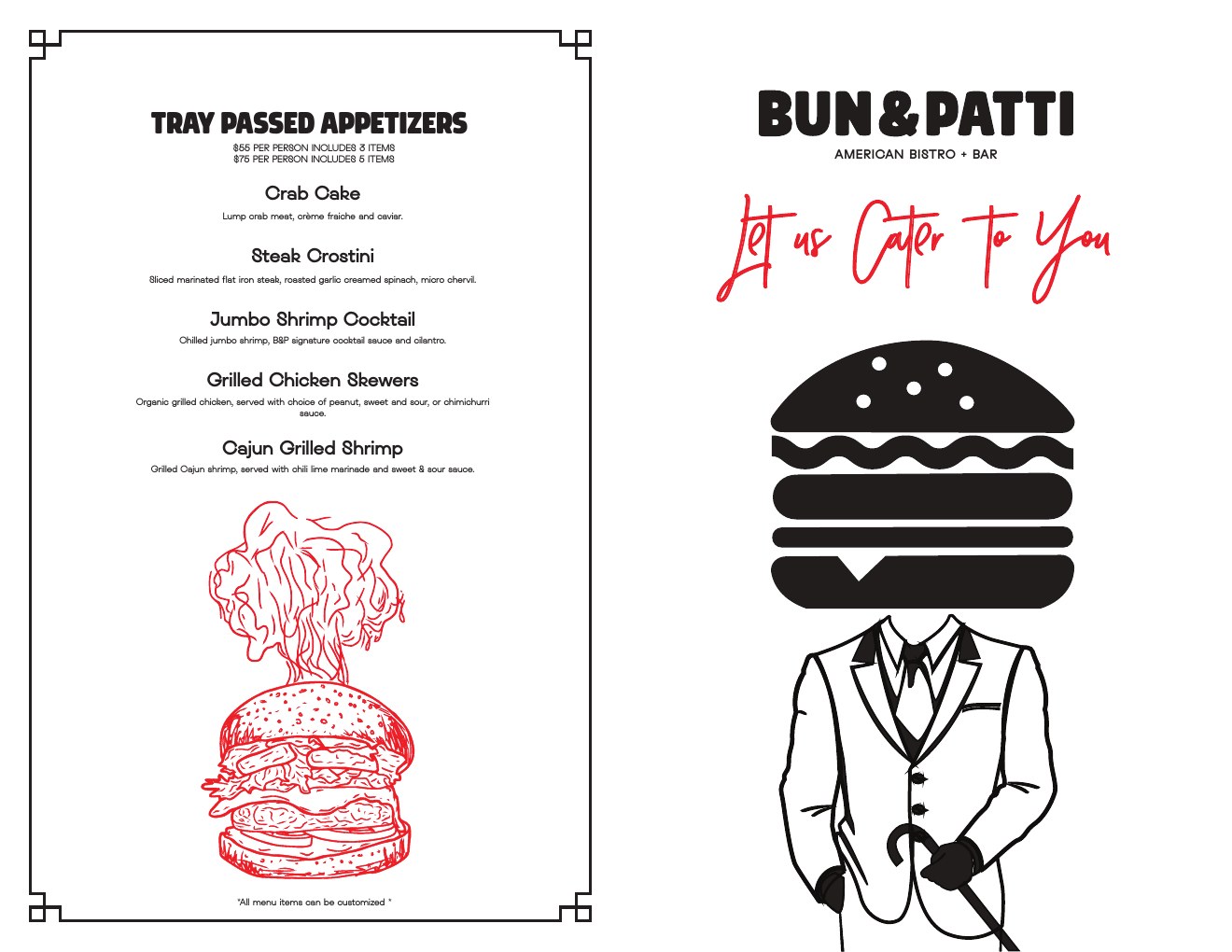
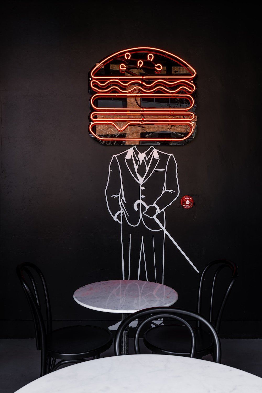
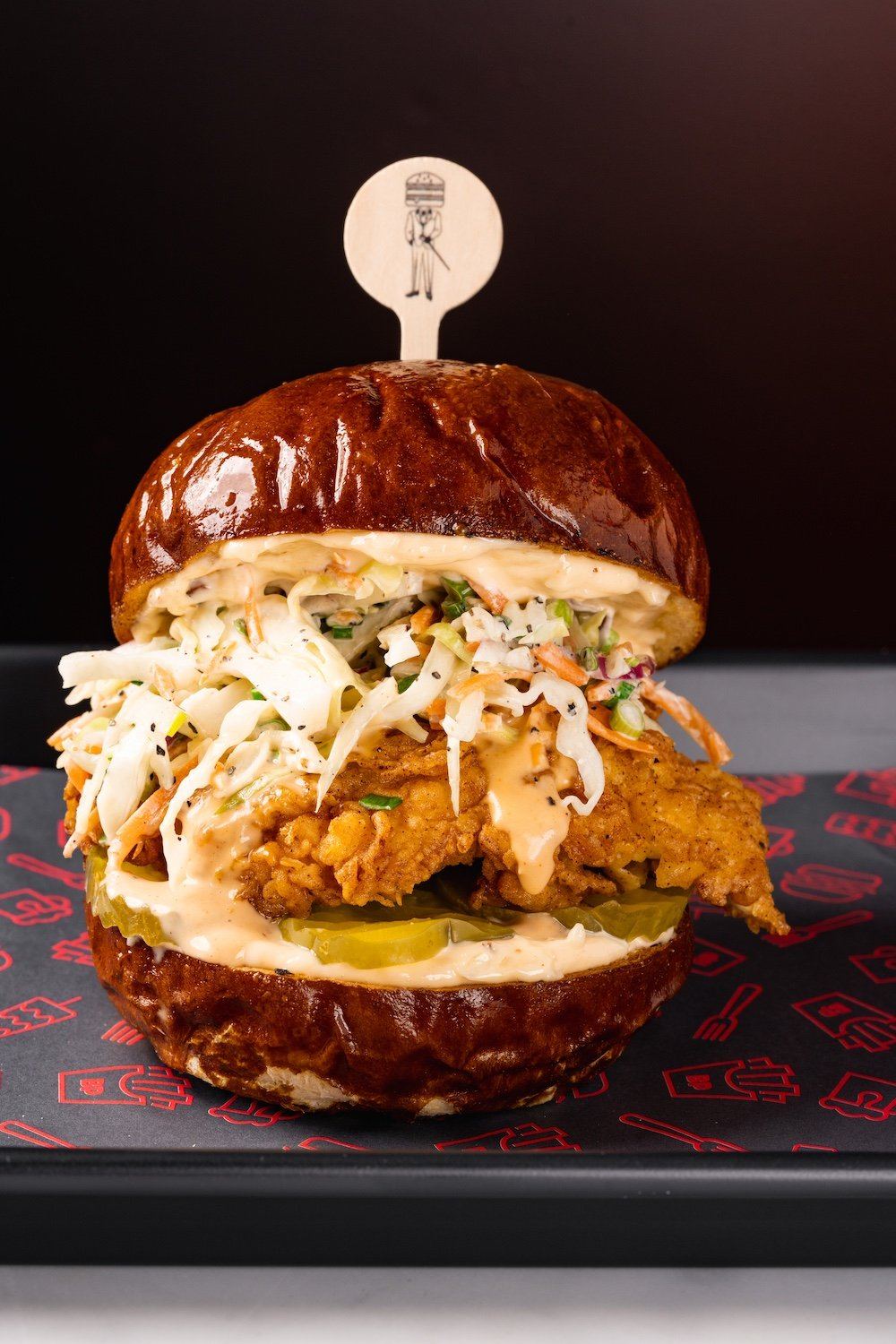
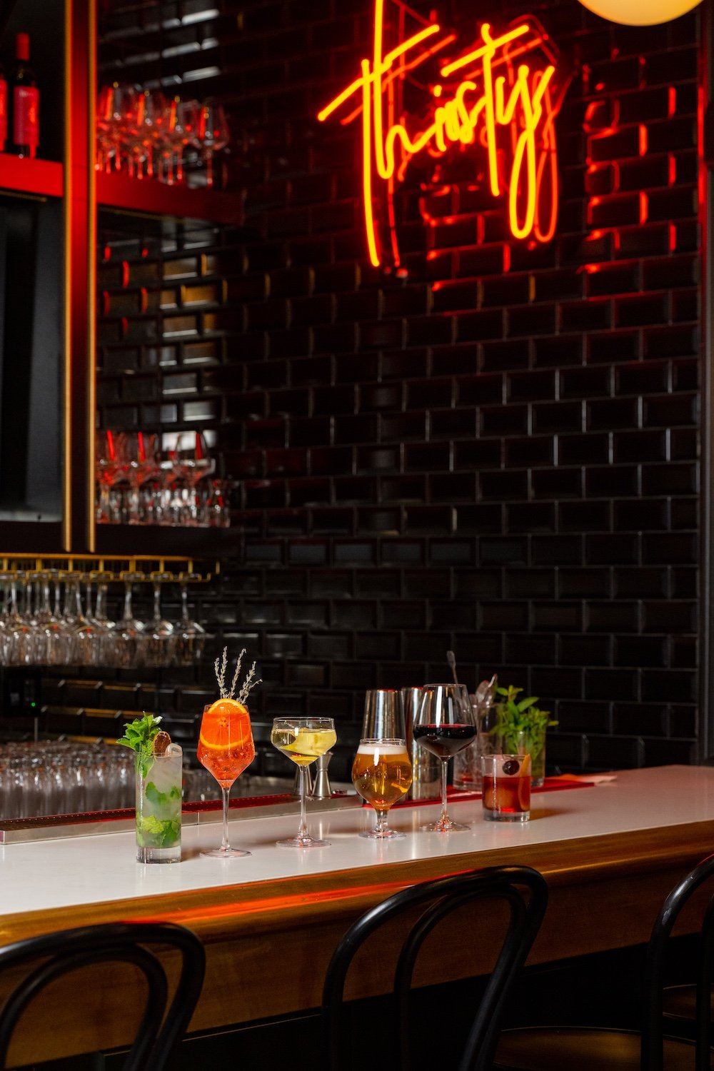
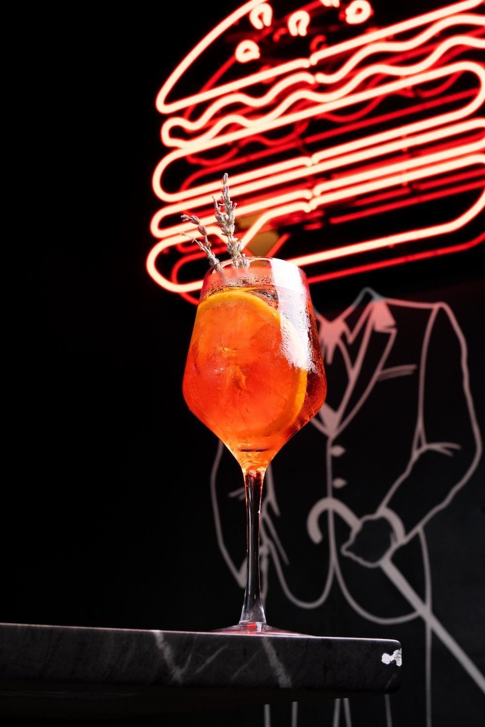
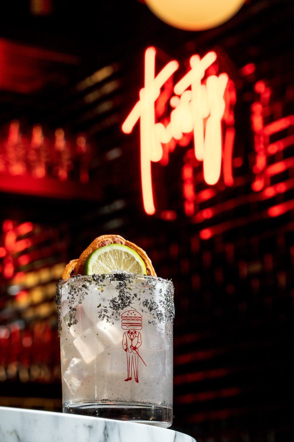
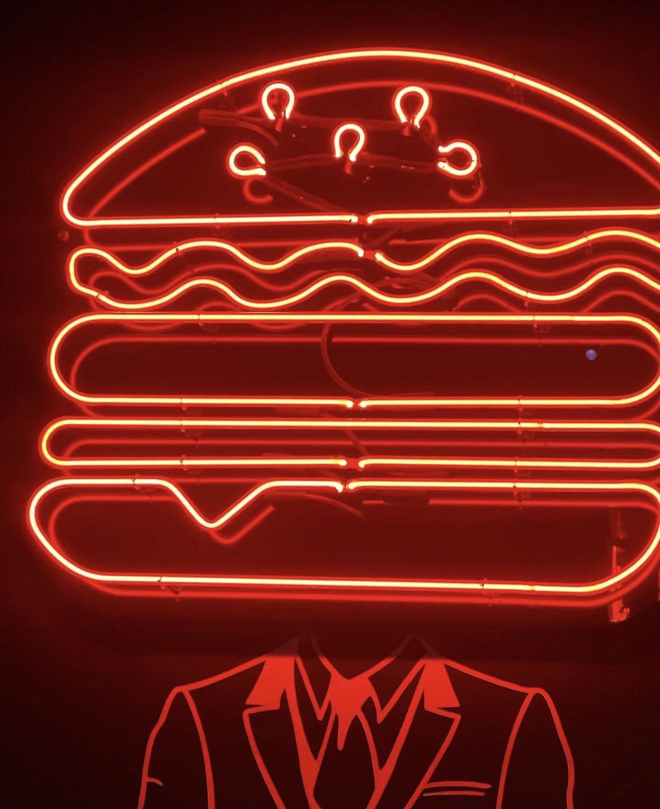
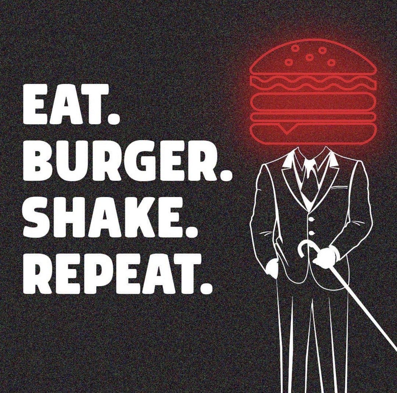
A burger-headed character in a suit runs through the whole thing — in neon on the dining room wall, as line art beside the bar, and stamped on the picks in the drinks. One idea, carried at every scale, which is what makes a small restaurant feel like a real brand.
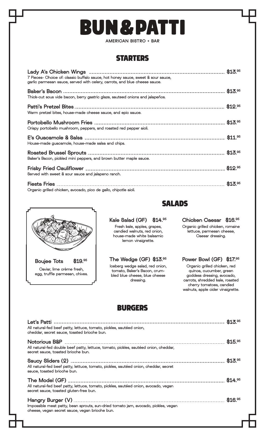
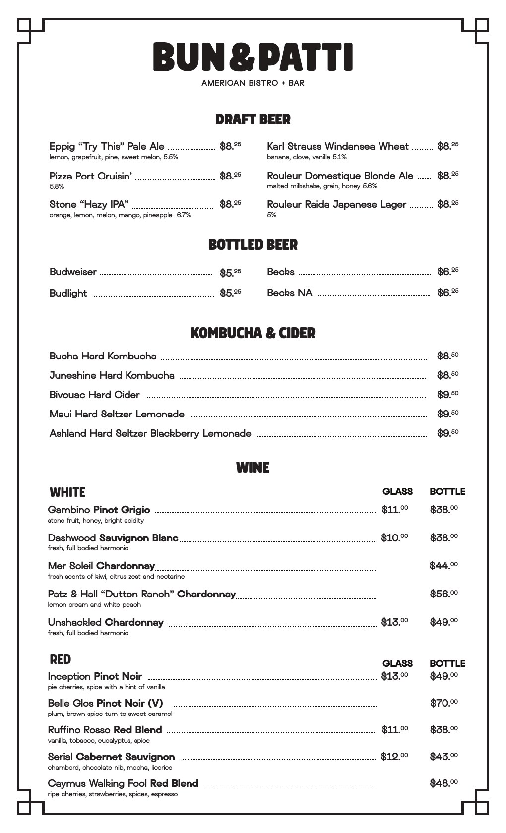
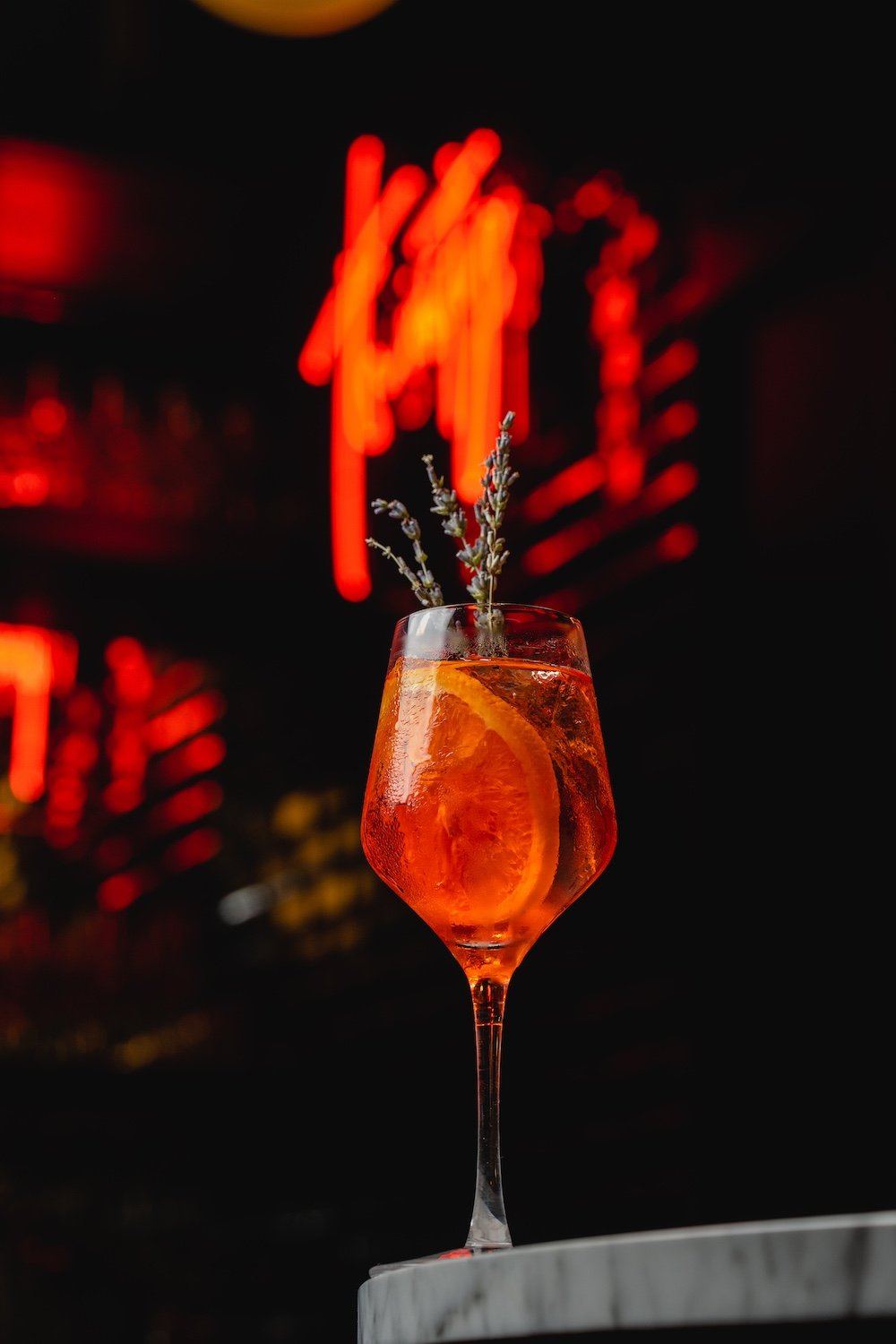
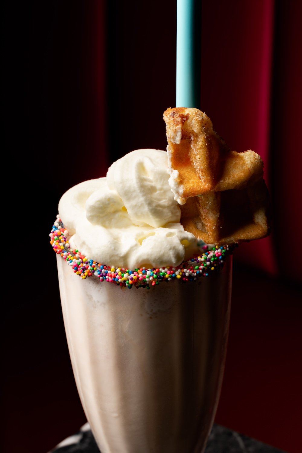
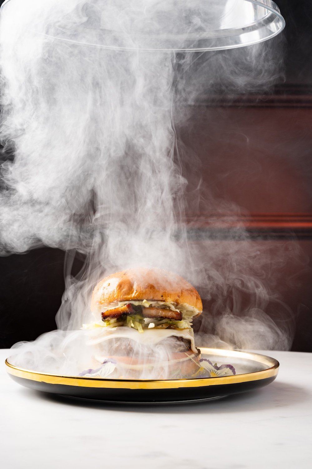
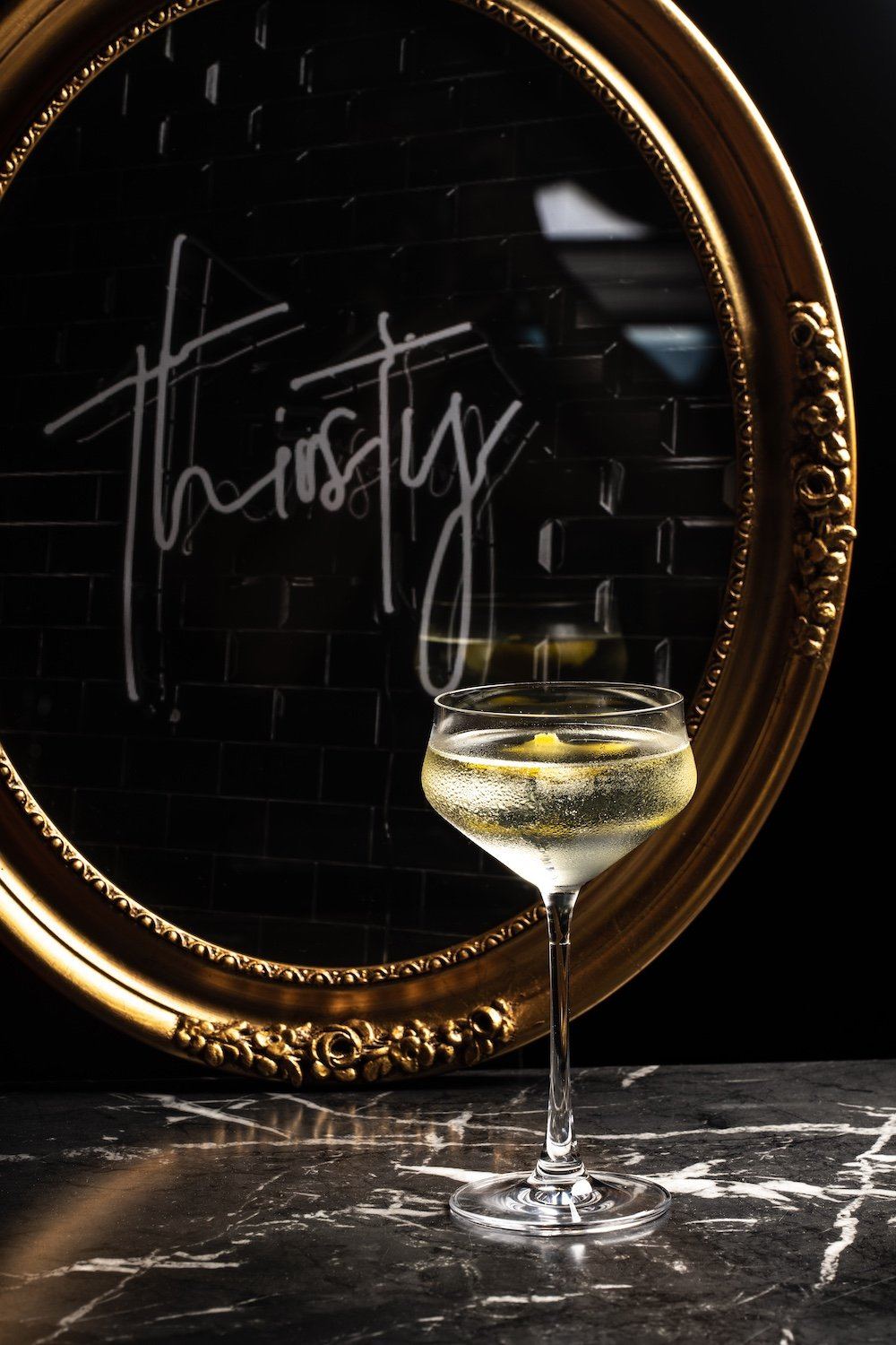
From there it ran through the whole experience: menu naming and menu design, interior signage and design direction for the space, creative direction and photoshoots for the food and drinks, then the social, marketing, and advertising to launch it.
We designed and built their website too — the brand carried from the sign to the screen.
The Bun & Patti brand — the burger built into the mark.
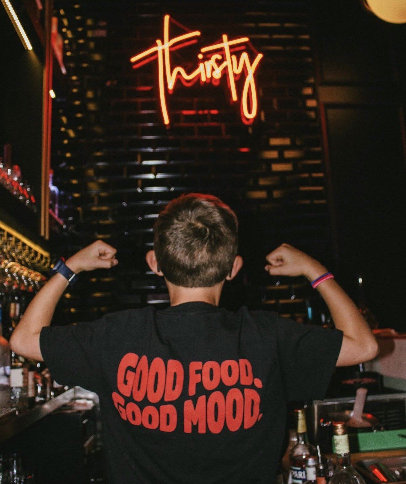
The signage, the characters, and the interior design direction.
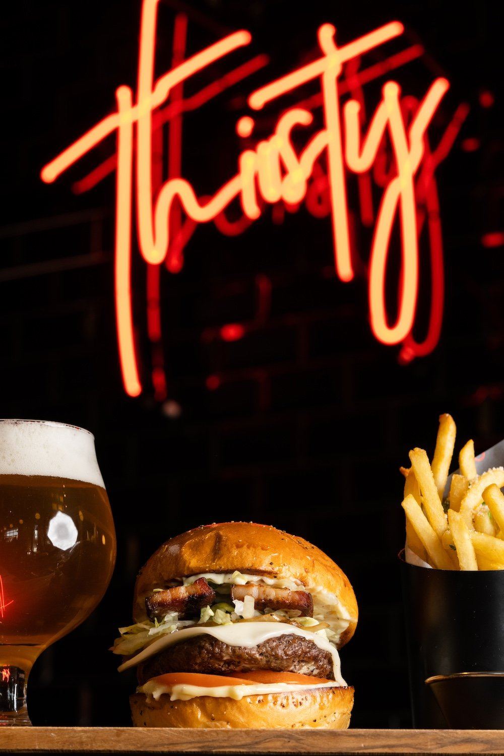
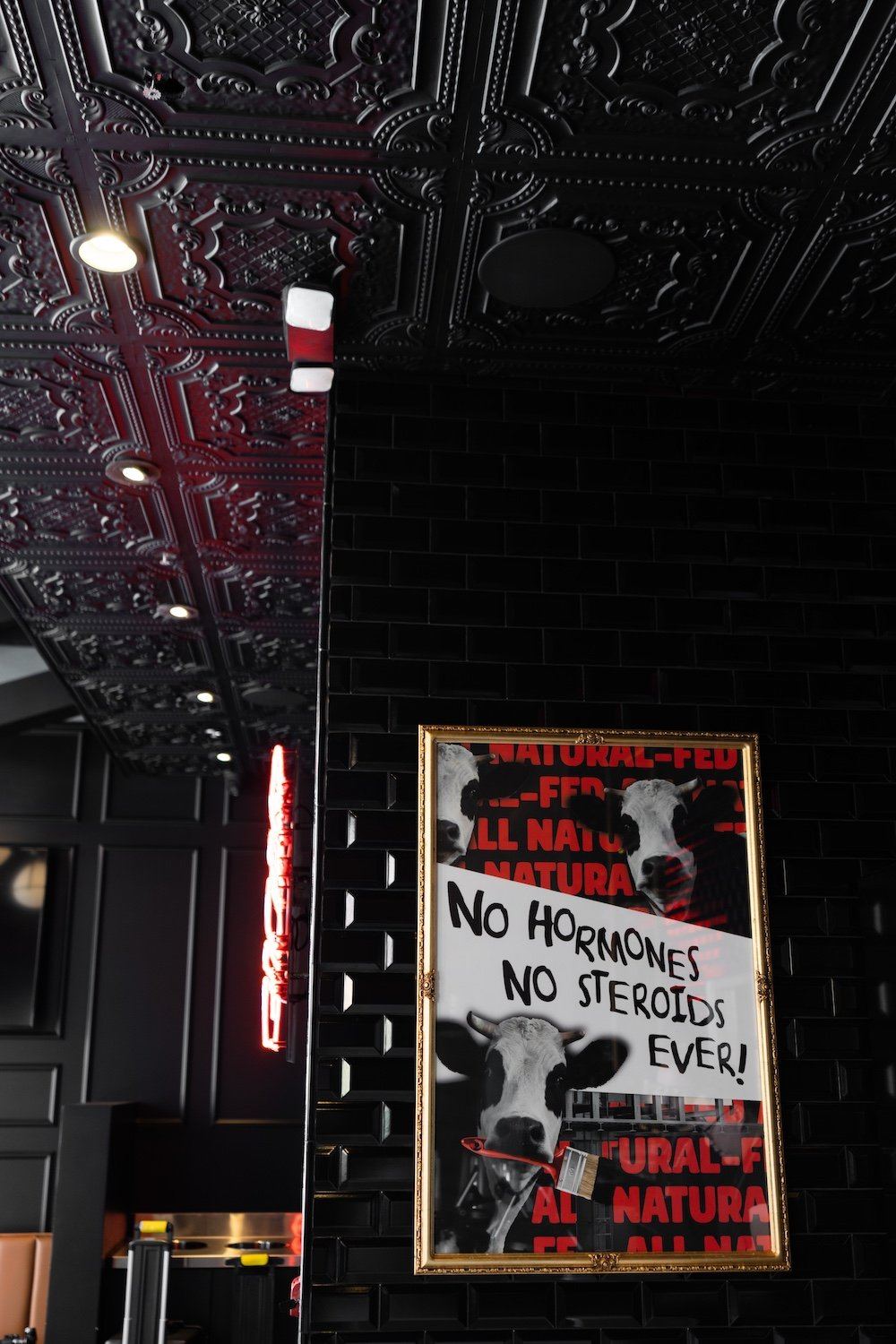
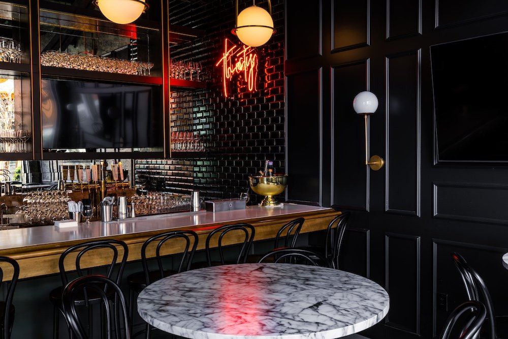
The food and the space.
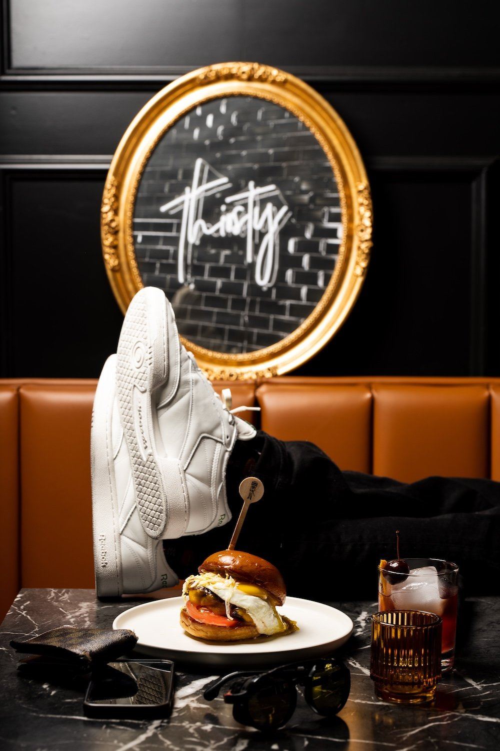
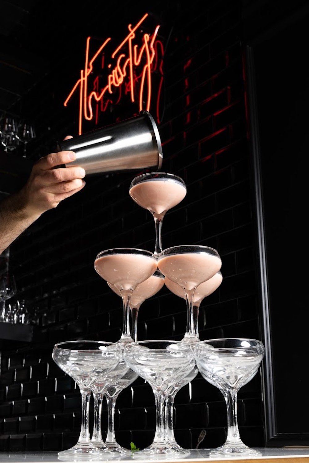
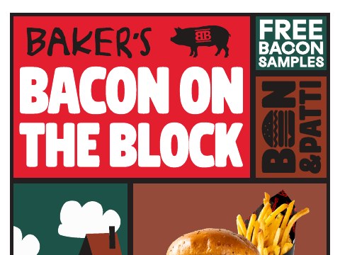
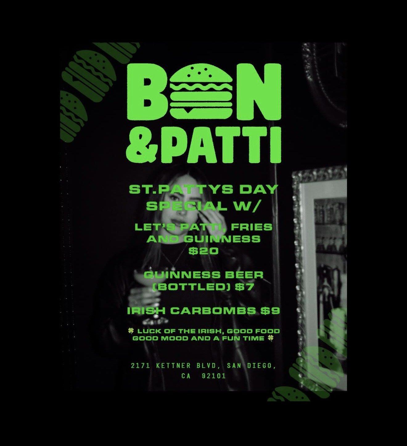
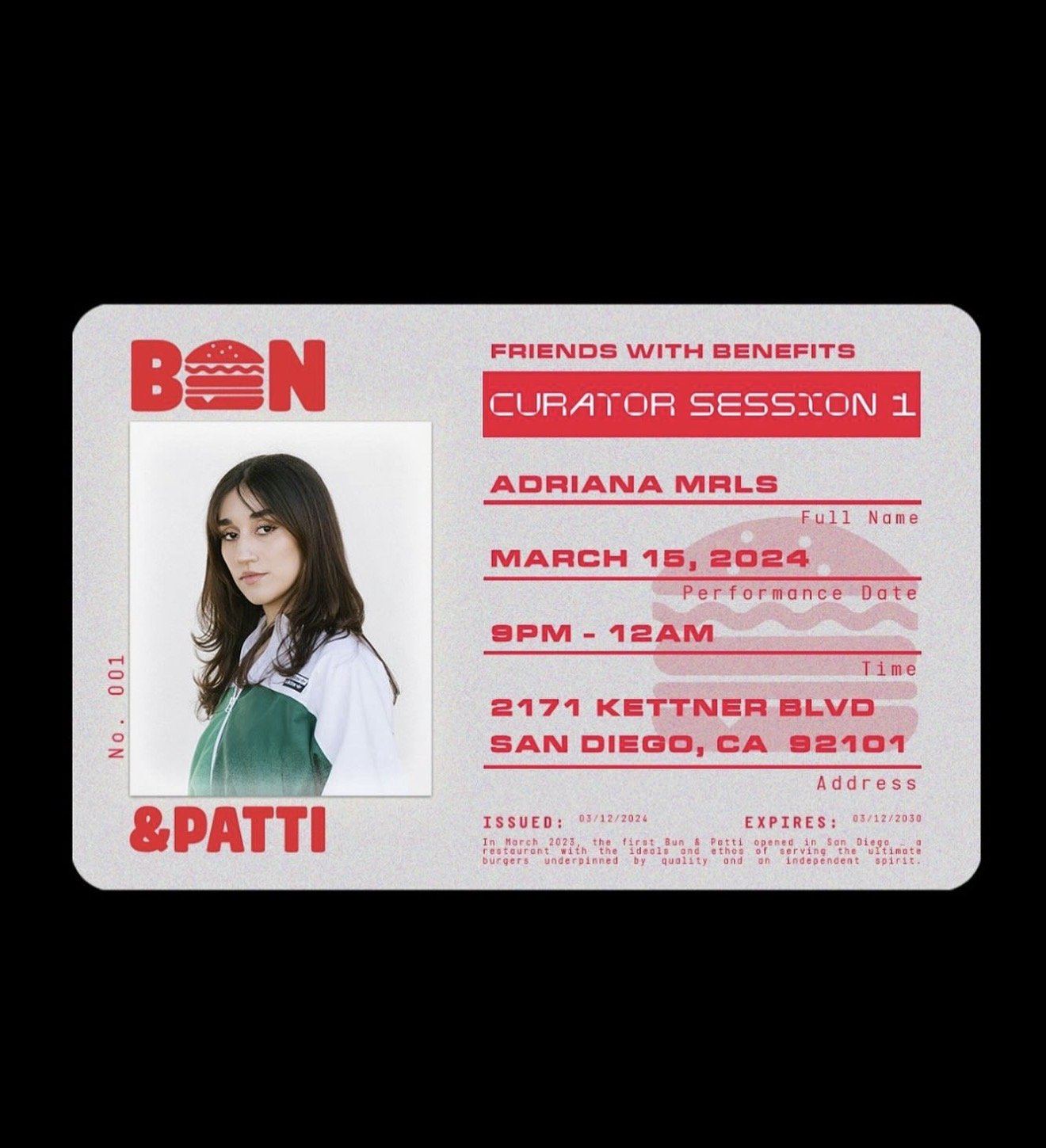
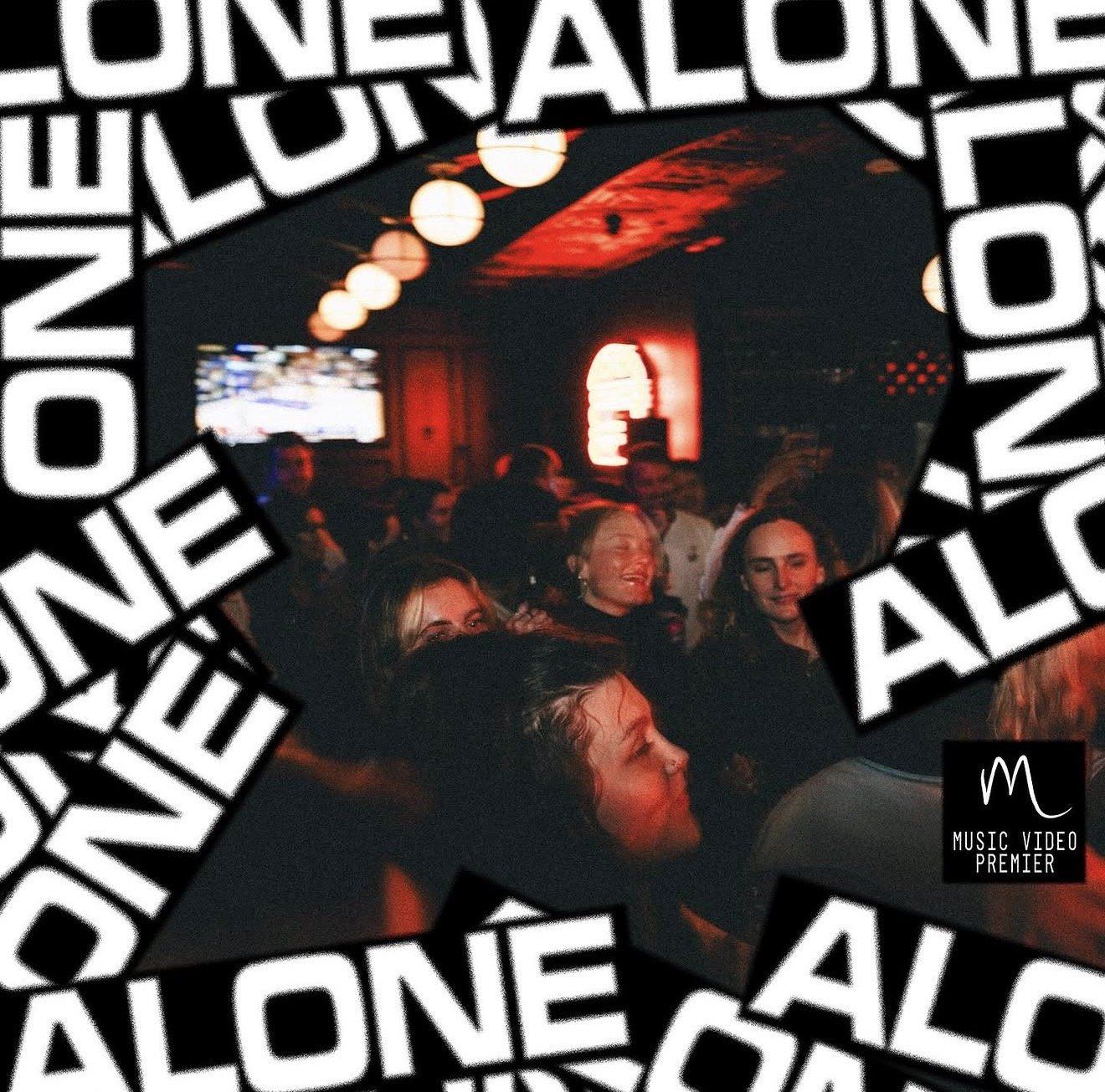
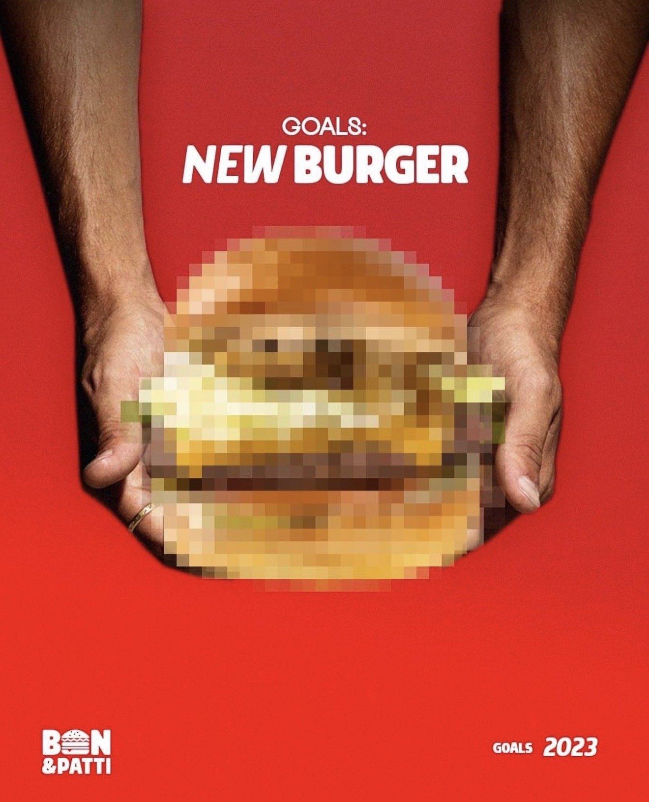
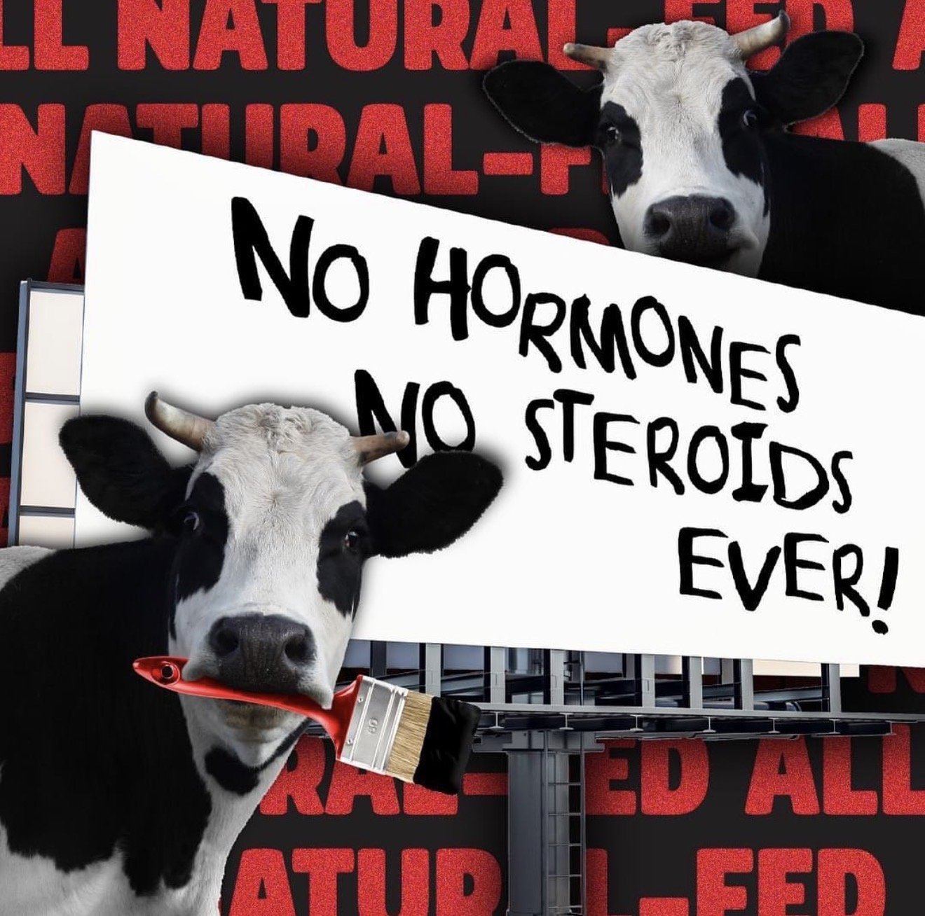
Campaign creative, event flyers, and the social feed — the brand with a sense of humour.
Tell us what's on your plate. We'll come back with what we'd do first and what it would cost, usually same day.
Prefer to talk? Call 442-291-9337 or book a free call →